
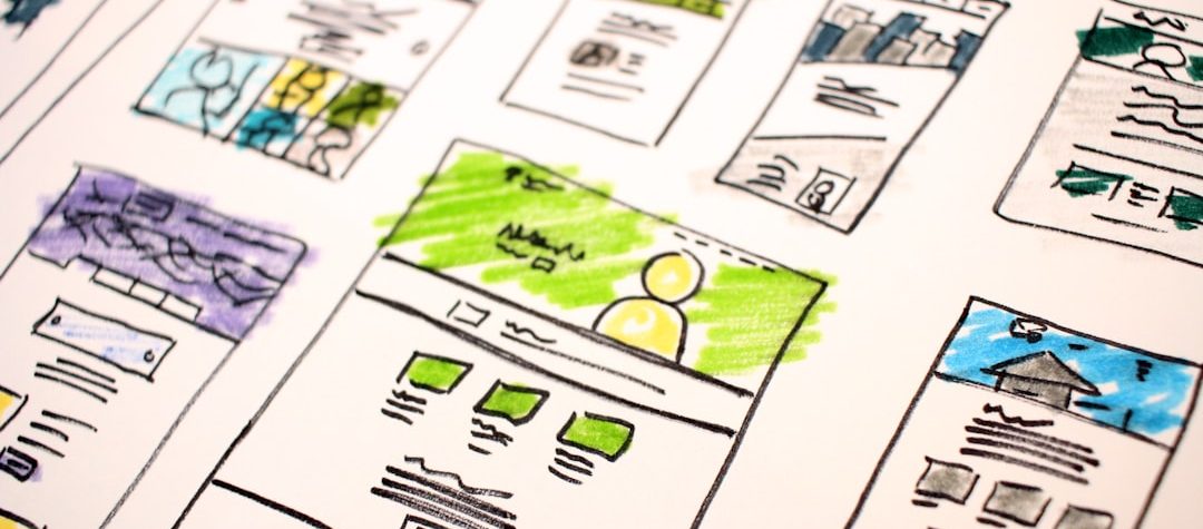
Visual hierarchy in web design is the system that tells users what to notice first, what to scan next, and where to act. This article explains how size, color, placement, and spacing shape attention, improve readability, and make pages easier to use on both desktop and mobile. If your layout feels busy, unclear, or low-converting, the fix is often not more content; it is a better order of emphasis.
Key Takeaways
- Hierarchy helps users understand a page faster by separating primary actions from secondary details.
- Size, contrast, spacing, and placement work together to create a clear reading path.
- Strong visual hierarchy improves usability, accessibility, and conversion by reducing cognitive load.
- Testing the layout on real devices is the fastest way to see whether the page leads the eye well.
How does visual hierarchy in Web Design help users understand a page faster?
Most visitors do not read a webpage from top to bottom in a perfect sequence. They scan for relevance, look for visual anchors, and decide within seconds whether a page deserves more attention. A clear hierarchy turns that scanning behavior into an advantage by making the most important content visibly dominant.
When hierarchy is weak, every element competes at the same level. Headlines blend with body copy, buttons disappear into the layout, and supporting details distract from the main task. When hierarchy is strong, users can quickly identify the page purpose, the next step, and the information that can wait.
This matters for more than aesthetics. Better hierarchy supports usability because it reduces effort, lowers confusion, and helps people complete tasks with less hesitation. On content-heavy sites, it also improves wayfinding, so readers can move through long pages without losing context.
Which design choices create the clearest hierarchy?
There are four core signals that shape attention on almost every interface: size, color, placement, and spacing. These are not decorative choices. They are decision-making tools that tell the eye where to go and tell the brain what matters most.
How should size guide attention?
Size is usually the fastest way to establish importance. Larger elements feel more dominant, so headlines, primary calls to action, and key product benefits should be visibly larger than supporting text.
The goal is not to make everything big. The goal is to create contrast between levels of information. If your H1, H2, buttons, and cards all share the same visual weight, the layout loses its structure and users have to work harder to interpret it.
Typography is a major part of this system. A strong type scale gives the page a clear rhythm, while consistent line height and paragraph spacing make scanning easier. In practical terms, users should be able to tell at a glance which copy is the main message and which copy is supporting detail.
How do color and contrast shape the reading path?
Color is most effective when it is used sparingly to signal priority. A single accent color for the primary button, status message, or highlighted link can guide attention immediately, especially when the rest of the interface stays more neutral.
Contrast matters just as much as hue. If important text or interface states blend into the background, the hierarchy breaks down and accessibility suffers. For color contrast, the W3C WCAG contrast guidance remains a reliable benchmark for making text and controls readable across devices and lighting conditions.
In modern interfaces, color should support meaning, not compete for it. Too many saturated elements create visual noise, while one controlled highlight can make the next step obvious without overwhelming the rest of the page.
Why does placement influence what users notice first?
Placement determines the order in which users encounter information. Content that appears higher on the page, closer to the focal point, or aligned with the main reading flow tends to receive attention first. This is why navigation, headline hierarchy, and the main call to action usually sit in the most visible zones of the layout.
Placement also works through grouping. When related items sit together, the user sees them as a single unit rather than separate fragments. That is especially useful in navigation menus, pricing tables, feature lists, and content cards, where structure should be easy to parse at a glance.
One common mistake is placing several equally important actions above the fold. If the page asks users to do too many things at once, the hierarchy becomes a tug of war. A clearer approach is to choose one primary action and let everything else support it.
How does spacing improve clarity?
Whitespace is one of the most underused hierarchy tools in web design. It creates separation, directs focus, and prevents dense layouts from feeling overwhelming. Without enough spacing, even well-chosen typography and color can feel cluttered.
Spacing helps users understand which elements belong together and which ones mark a new idea. That is why generous padding around a primary CTA, section headings, or featured content can make those elements feel more important without changing the content itself.
Good spacing also improves readability on smaller screens. Responsive design compresses the available space, so the layout must preserve breathing room as columns collapse and interface blocks stack vertically. When spacing adapts well, hierarchy stays intact across breakpoints.
How should hierarchy change across page types?
Different pages have different goals, so the hierarchy should match the task. A homepage needs orientation, a product page needs decision support, and an article page needs readability. The same visual pattern will not serve all three equally well.
What should a homepage emphasize first?
A homepage should answer three questions quickly: what the site offers, who it is for, and what to do next. The most important elements are usually the headline, a concise supporting statement, and a single primary action. Secondary navigation and extra content can appear lower or be styled more quietly.
Homepages often fail when every section tries to become the star. A better hierarchy uses one strong opening message, a clear visual anchor, and a limited set of choices. That creates a faster path to exploration instead of a crowded first impression.
What does a strong product or service page need?
Product and service pages should reduce uncertainty. The highest-priority elements are the value proposition, proof points, pricing or package cues, and the action that moves the user forward. Supporting copy, FAQs, testimonials, and feature lists should reinforce the primary choice rather than distract from it.
Visual hierarchy is especially important when users are comparing options. Clear section headings, distinct buttons, and grouped information blocks help them process differences without reading every line. The layout should make the decision easier, not harder.
How should editorial and blog layouts be structured?
Editorial pages depend on scanability. Readers often want the main idea, the subtopics, and the actionable insight before they commit to a long read. A clear headline, a logical subheading sequence, and short paragraphs create a rhythm that supports that behavior.
In long-form content, hierarchy also helps the page feel trustworthy. Readers can see the structure, understand where the article is going, and return to a section later if needed. That is useful for guides, tutorials, knowledge bases, and research-driven content.
What does usability research suggest about hierarchy?
Usability testing consistently shows that users rely on visual cues before they rely on careful reading. People scan for anchors, such as bold headings, clear buttons, and recognizable section breaks, because those elements reduce the effort needed to find relevant information.
Design teams often validate hierarchy with simple, real-world checks: a five-second first impression test, a mobile review, or a comparison between two layout versions. If users can explain the page purpose quickly and identify the main action without help, the hierarchy is doing its job.
These observations align with accessibility best practices as well. Clear structure, visible contrast, and predictable grouping improve perception for everyone, including users on smaller screens, users with low vision, and people navigating with assistive technologies.
How can you test and improve visual hierarchy?
The fastest way to improve hierarchy is to look at the page with the user’s goal in mind. Ask what the visitor needs first, what can wait, and what should never compete for attention. Then edit the design so the answer is visible without inspection.
A practical workflow starts with the dominant element. If the main headline, primary CTA, or hero image is not obviously the visual anchor, increase its size, strengthen the contrast, or add space around it. If several elements feel equally important, demote the least critical ones until the page has a clear order.
Next, check the layout on a phone. Mobile screens expose hierarchy problems quickly because there is less room for ambiguity. If the mobile version reads like a list of unrelated blocks, the spacing, grouping, or type scale needs refinement.
A simple hierarchy audit
Review the page from top to bottom and answer four questions. What is the first thing the eye sees? What is the next action? Which details are supportive rather than essential? What can be removed without changing the core message? If you cannot answer those questions confidently, the layout needs a cleaner visual order.
It also helps to compare the page against the brand’s real business goal. If the goal is lead generation, the contact path should be unmistakable. If the goal is education, the reading flow should feel calm and structured. If the goal is product discovery, the hierarchy should help users compare without friction.
What mistakes weaken the reading path?
One of the most common problems is equal emphasis. When headlines, buttons, cards, and imagery all demand attention at once, the interface has no clear focal point. Users may still understand the content, but they will do so more slowly and with more effort.
Another frequent issue is inconsistent styling. If similar elements look different from page to page, users cannot rely on the pattern. Inconsistent heading levels, random button styles, and uneven spacing make the interface feel less predictable and less professional.
Overusing color is another hierarchy killer. If every section is highlighted, nothing stands out. A better strategy is to reserve strong color for the most important action or message and let the rest of the interface support it with quieter tones.
Finally, dense layouts often hide the path forward. Long blocks of text, tight margins, and weak section breaks make pages feel heavier than they are. By contrast, a layout with intentional spacing, clear headings, and a restrained palette helps users move through the content with less resistance.
If you want a practical next step, audit one key page and remove one layer of visual competition: reduce a secondary color, simplify a crowded section, or enlarge the main action. The best visual hierarchy is usually the one that makes the next step feel obvious before the user has to think about it.
Leave a Reply